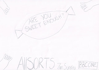
Here is a sketch of what we want our print advert to look like:

I took photos of a variety of hands on a white background, so it was easy to crop on photoshop,I took a photo of both a mans, a childs and a womans hands as this connotes families and symbolises our target audience. These hands will be used at the corners of the page and will look like there going to grab the sweet.


I also took photos of a purple quality street as this will be used in the centre of the page for the hands to grab. I also took a picture of this on a white background so it is easy to crop aswell. I want to photoshop the sweets so I can take out the 'quality street' writing and replace it withour slogan 'are you sweet enough?'.


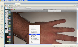
For the print advert I used photoshop to produce it. I used the magic wand and the polygonal lasso to crop around my photo's of the hands and the sweet.
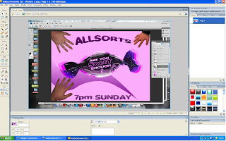
I downloaded sweet as candy font to use for both our slogan, title and scheduling, this makes the font symbolise sweets, the colours I also used symbolise sweets as I have used pinks and purples.
For the photo of the sweet I made it bigger and overlayed it so it looks 3D this makes the image look more eyecatching.
For the background I used a gradient that was a contrast of white and pink, and I drew a swirl with the pen tool, and used a gradient.
For the sweet and the hands I rotated them so it looks like the hands are going to grab the sweet.
I copied the 'BBC ONE' logo off the internet as that was the only item we could get off the internet, and I cut out the writing off the red background and made the colour of the writing pink so it blends in with the advert.
Also for the 'ALLSORTS' title I used the bend tool to make it look more eye catching for the audience.


No comments:
Post a Comment