Tuesday, 5 January 2010
Wednesday, 9 December 2009
Evaluation
FRAMING
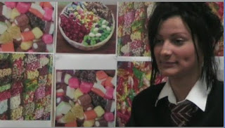
The framing we have chosen to use for our interviews follows the codes and conventions of professional interviews. They are either framed to either the left or right of the shot, and their eye line is roughly one third of the way down the screen.
 GRAPHICS
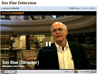
We have used graphics to anchor who the person is and their relevance to the topic. We have positioned the graphics either on the bottom left or right of the screen.
 http://www.dailymotion.com/video/x20rcc_jon-else-interview
  CUTAWAYS
We have edited the interviews so that the questions we asked are not heard and to help make the sequence flow. We have placed cutaways at these edit points to avoid jump cuts in our production. 

 http://www.dailymotion.com/video/x2apiq_metal-a-headbangers-journey-arch-en_music


 CAMERA MOVEMENT
We used zoom to create a more intresting effect on our filming. 


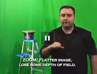
 http://www.dailymotion.com/video/x973b3_focal-point-video-tip-episode-2-dol_shortfilms
We used panning in our documentary again to add intrest to the filming. 


 http://www.dailymotion.com/video/x6089l_artoonixmakingapanningshottutorial_news
VOICEOVER
The voiceover we have used sounds bubbly as our documentary is quite informal. We used a female voice as the target audience for our documentary is families, and a female voiceover is mainly used in family documentaries. The narrative structure our group chose to use was a linear structure. We chose this structure as it is simple to follow and easy to understand. The voiceover we have used holds the narrative together.
MUSIC
The music tracks we used are also bubbly so they relate to the target audience. The music tracks we have used all have connotations of sweets, anchoring the meaning of the documentary. I emailed sony to ask for copyright permission to use the tracks we have used in our documentary.  ARCHIVE MATERIAL
The archive material we have used is from ‘Charlie and the Chocolate Factory’ the film. We used this because in the interview with the children fantasising about a world made out of sweets it creates symbolism for the sweets in Willy Wonkers chocolate factory. 
 http://www.dailymotion.com/video/x8clz9_mine-eyes-archival-material-by-lia
2. How effective is the combination of main product and ancilliary tasks?
Radio Advert Voiceover
From children’s parties to cinema trips, even to that hidden stash under your bed, sweets are part of everyday life.
Bon, bons, sour balls, nibbles and wine gums.
We all have our favourites.
So what’s yours?
Tune in to Allsorts, 7pm, Sunday BBC ONE.
For the radio trailer because our documentary is being shown on BBC One I would play it on most BBC radio stations such as, BBC radio one, BBC radio one xtra, BBC radio two, BBC radio three, BBC radio five, BBC radio six, BBC radio seven, BBC radio A, and BBC radio nations and local. However I would not play it on BBC radio 4 as this radio has a more formal audience and our programme would not appeal to them. I would also put it on regional radio stations such as BBC Merseyside as they also have family orientated audiences. I would schedule the trailer on drive times and morning shows as this is when people will be travelling to/ from work and when parents will be picking up children from school.

I would put the print advert in national papers as it will attract a wide range of people as a lot of people will read them. The papers I would advertise in would be: The star, the mirror, the daily mail, the Sunday times, the news of the world, the daily mirror and the people and more family orientated national newspapers.


I would put the print advert in national papers as it will attract a wide range of people as a lot of people will read them. The papers I would advertise in would be: The star, the mirror, the daily mail, the Sunday times, the news of the world, the daily mirror and the people and more family orientated national newspapers.
3. What have you learnt from your audience feedback?
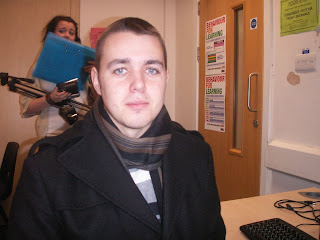
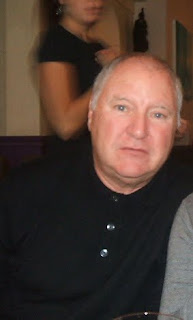
We shown our documentary to a focus group of 25people in our class. We did this to gain some audience feedback on what they thought about our documentary, print advert and radio trailer. I took down quotes and recordings of individuals from this class. Also i went out of school to get audience feedback so the feedback would differ as the audiences i asked are of different genders and ages.
95% of our focus group believed our product was to a professional standard.
100% of the focus group raised their hand when we asked this question as they all believe the first five minutes were relevant.
Here are the comments I got from our audience....

“When I first watched it I really thought it was a professional documentary.”

“I would like to watch the rest of this documentary, yes, you can clearly see that the documentary is about sweets and the cutaways that are used are very intriguing.”

“I think the strengths of your documentary are that it’s very uplifting and the interviews are very interesting”.

“The only weakness I could think of is that at the end, the filming is hushing”.

“The print advert is very eye catching as you have used bright colours and it also links to the documentary as the colours that you have used are colours that connote sweets, and yes by seeing this advert I think I would watch the documentary”

“I think if I heard this radio trailer on the radio I think it would encourage me to watch the documentary, and the fact that you’ve used extracts from the documentary gives you a pretty good idea what the documentary will contain".




4. How did you use media technologies in the construction and research, planning and evaluation stages?
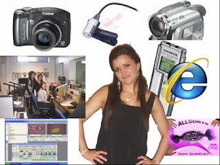
The technology I used to produce my three media products where:
A digital camera to upload evidence of what we filmed, and to take photos for the print advert I made.
We used the internet to find out what songs we could use, and who they where by, researched content and genre of documentaries, produce our blog, and find screen grabs for our blog.
I used a voice recorder to record peoples voices to get feedback on our documentary.
We used a camera to record our documentary and to capture what we had r what we had recorded and to edit our documentary and our radio advert.
We had to use a radio studio to record our radio trailer and voiceover for our documentary.
To create our print advert I used Photoshop to crop pictures, edit them and produce our final product.
Tuesday, 1 December 2009
Print Advert
Here is a sketch of what we want our print advert to look like:
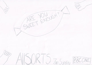
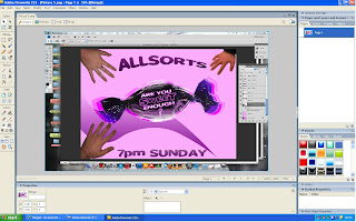
I took photos of a variety of hands on a white background, so it was easy to crop on photoshop,I took a photo of both a mans, a childs and a womans hands as this connotes families and symbolises our target audience. These hands will be used at the corners of the page and will look like there going to grab the sweet.


I also took photos of a purple quality street as this will be used in the centre of the page for the hands to grab. I also took a picture of this on a white background so it is easy to crop aswell. I want to photoshop the sweets so I can take out the 'quality street' writing and replace it withour slogan 'are you sweet enough?'.


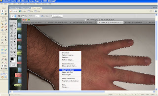
For the print advert I used photoshop to produce it. I used the magic wand and the polygonal lasso to crop around my photo's of the hands and the sweet.
I downloaded sweet as candy font to use for both our slogan, title and scheduling, this makes the font symbolise sweets, the colours I also used symbolise sweets as I have used pinks and purples.
For the photo of the sweet I made it bigger and overlayed it so it looks 3D this makes the image look more eyecatching.
For the background I used a gradient that was a contrast of white and pink, and I drew a swirl with the pen tool, and used a gradient.
For the sweet and the hands I rotated them so it looks like the hands are going to grab the sweet.
I copied the 'BBC ONE' logo off the internet as that was the only item we could get off the internet, and I cut out the writing off the red background and made the colour of the writing pink so it blends in with the advert.
Also for the 'ALLSORTS' title I used the bend tool to make it look more eye catching for the audience.
